Nashville Physical Therapy & Performance
A physical therapy startup in Nashville wanted to carve out a distinct position in a market where most competitors prioritized patient volume over patient outcomes. They needed everything — a name, a brand, a website, and marketing materials — built from scratch.
From the Ground Up.
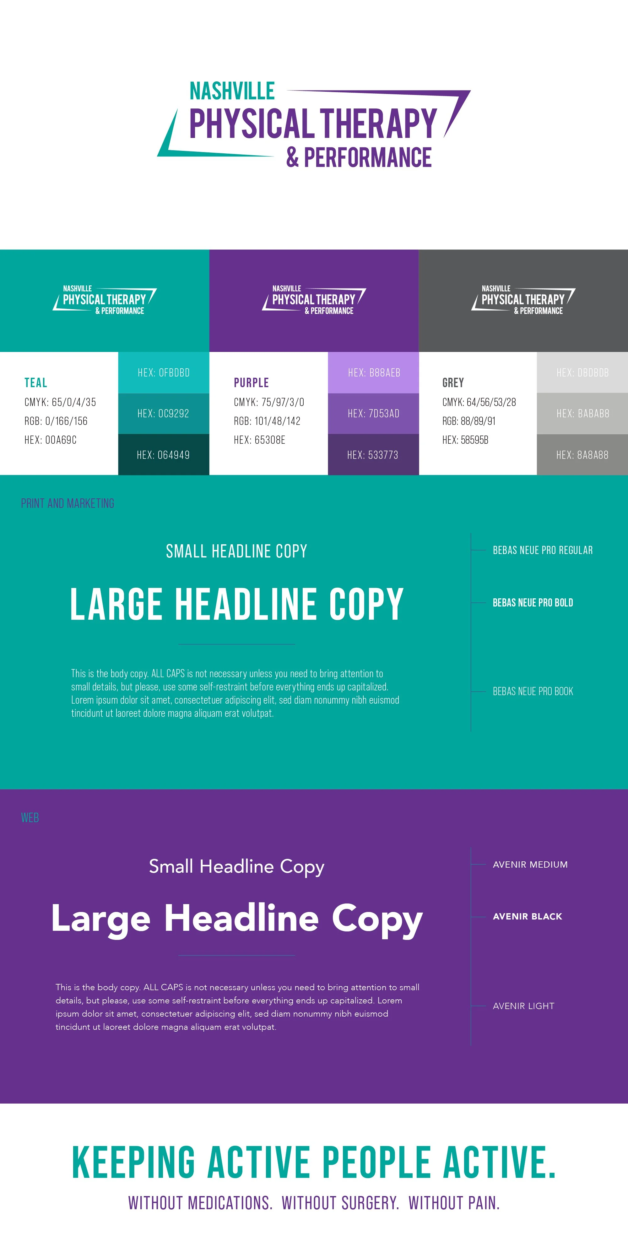
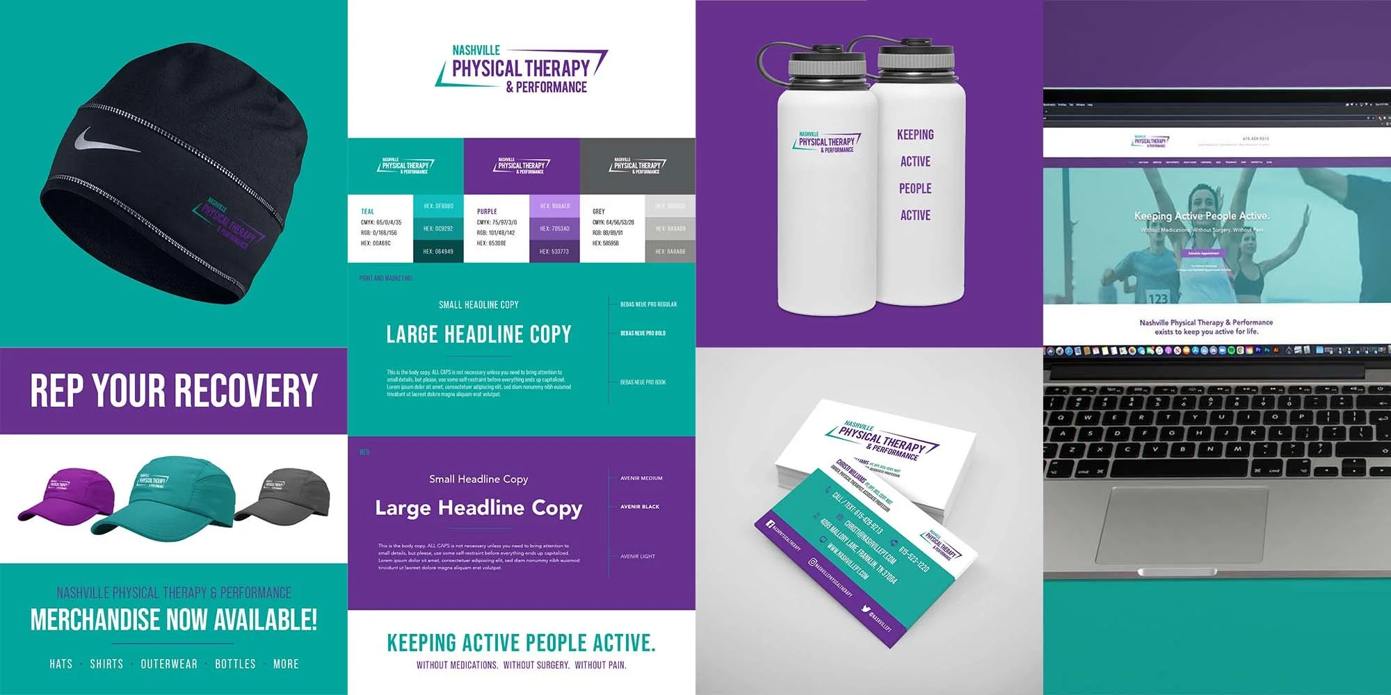
I started with naming strategy, helping identify a name (Nashville Physical Therapy and Performance) that was both clearly descriptive and SEO-friendly given their location. The logo was designed to evoke the shape of Tennessee while conveying energy and movement. Purple — the client's desired primary color — was paired with teal for contrast and a tone that felt both calm and credible.
Establishing a Web Presence
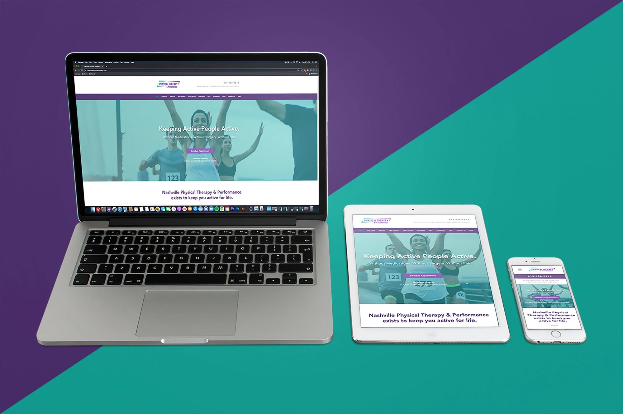
The Wix website was built for easy owner updates and structured to introduce the therapists by name and face, making patients feel familiar with their provider before their first visit. Brand materials and merchandise — business cards, water bottles, beanies — were designed to support word-of-mouth and community presence.
Growth Potential
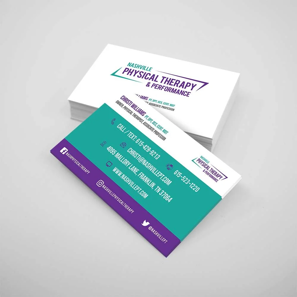
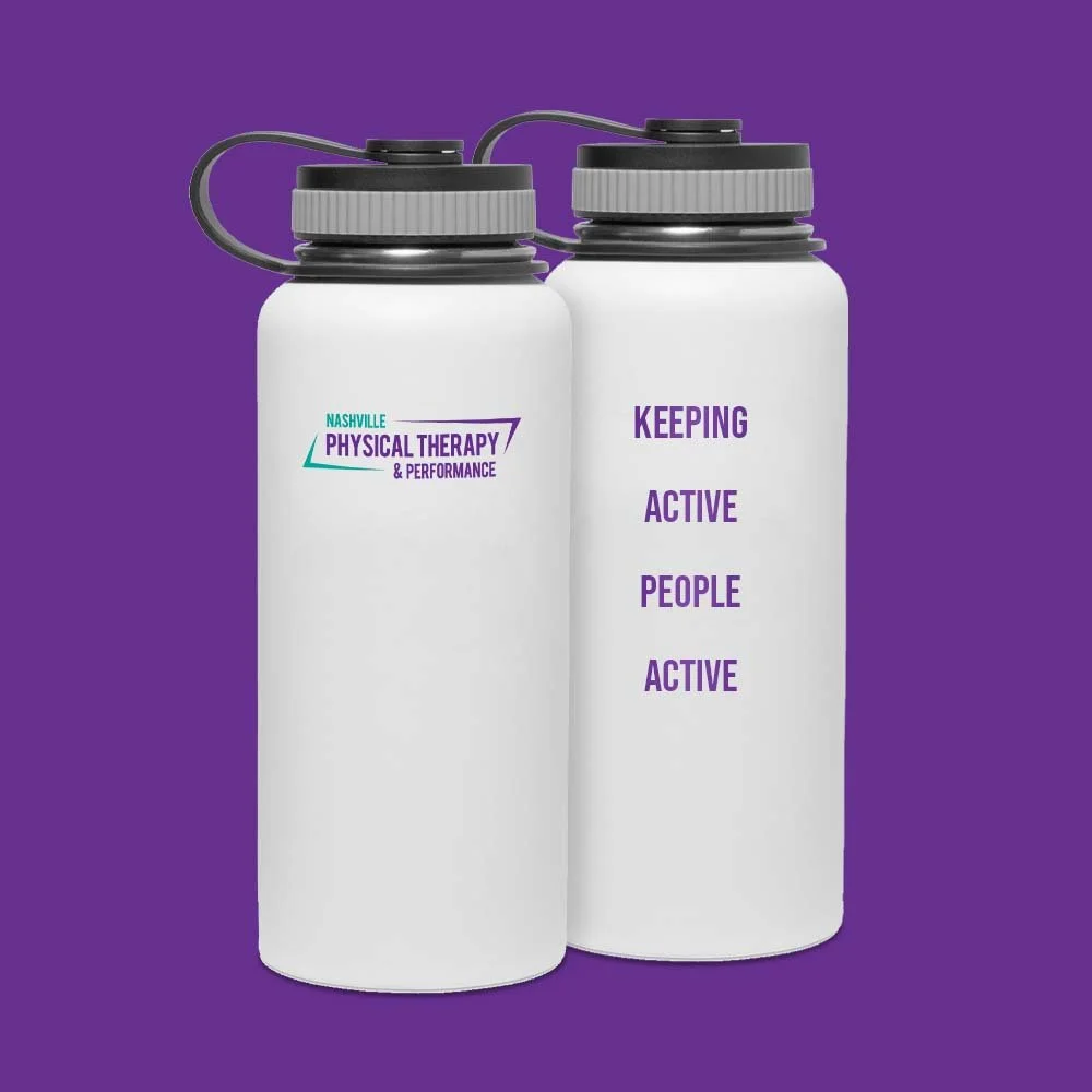
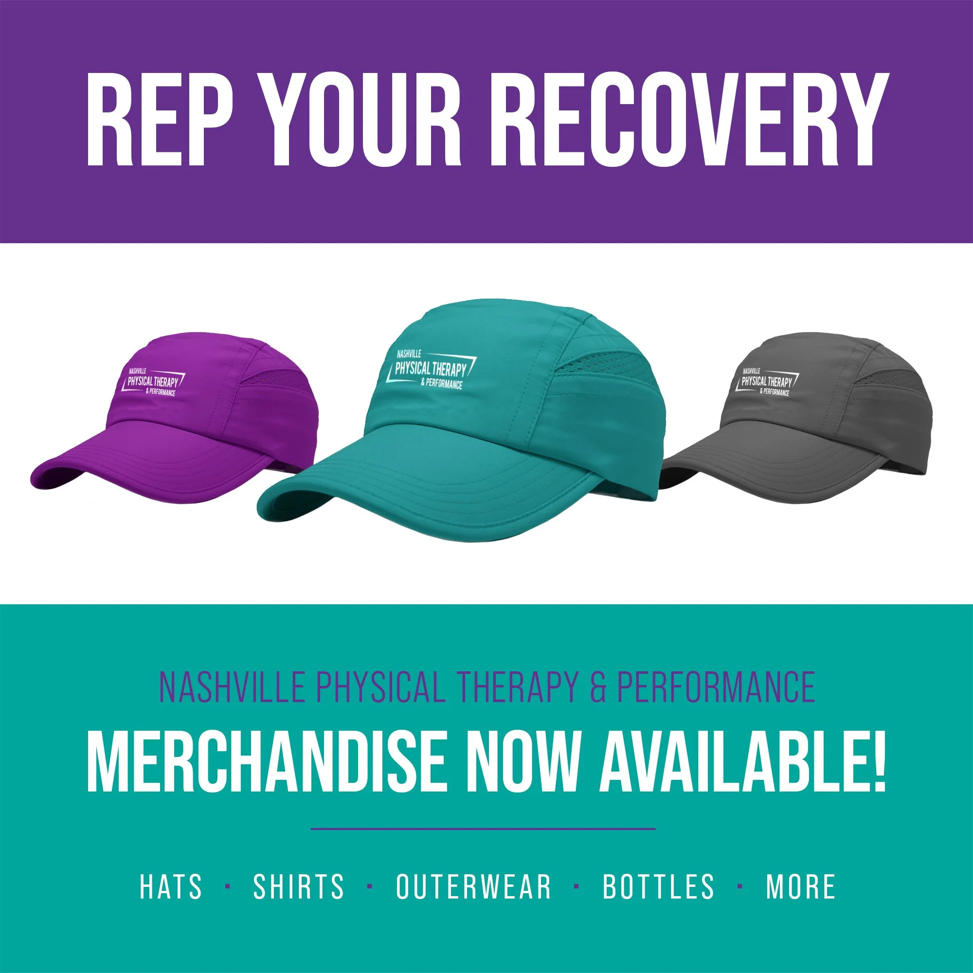

Various brand materials and social media posts were created to help with general marketing. Business cards and merchandise were needed to help spread word and improve customer loyalty while supporting various communities within the city.
Nashville Physical Therapy and Performance has continued to grow in team size and patient volume. The optimized business name and SEO-focused site architecture have made them a top result when searching for physical therapy in Nashville.