Knoxville Bankruptcy Attorneys
A web and SEO firm reached out on behalf of a bankruptcy law practice looking to establish their brand identity. The challenge was balancing professional authority — the weight you want in a legal brand — with approachability. People seeking bankruptcy help are often stressed and vulnerable. The brand needed to feel trustworthy without being cold or intimidating.
Options, options, options.


I explored several directions rooted in legal iconography: pillars, courthouses, scales of justice, financial motifs. The client had requested blue as the primary color to differentiate from the green-heavy competition in their market.
A Decision Has Been Made
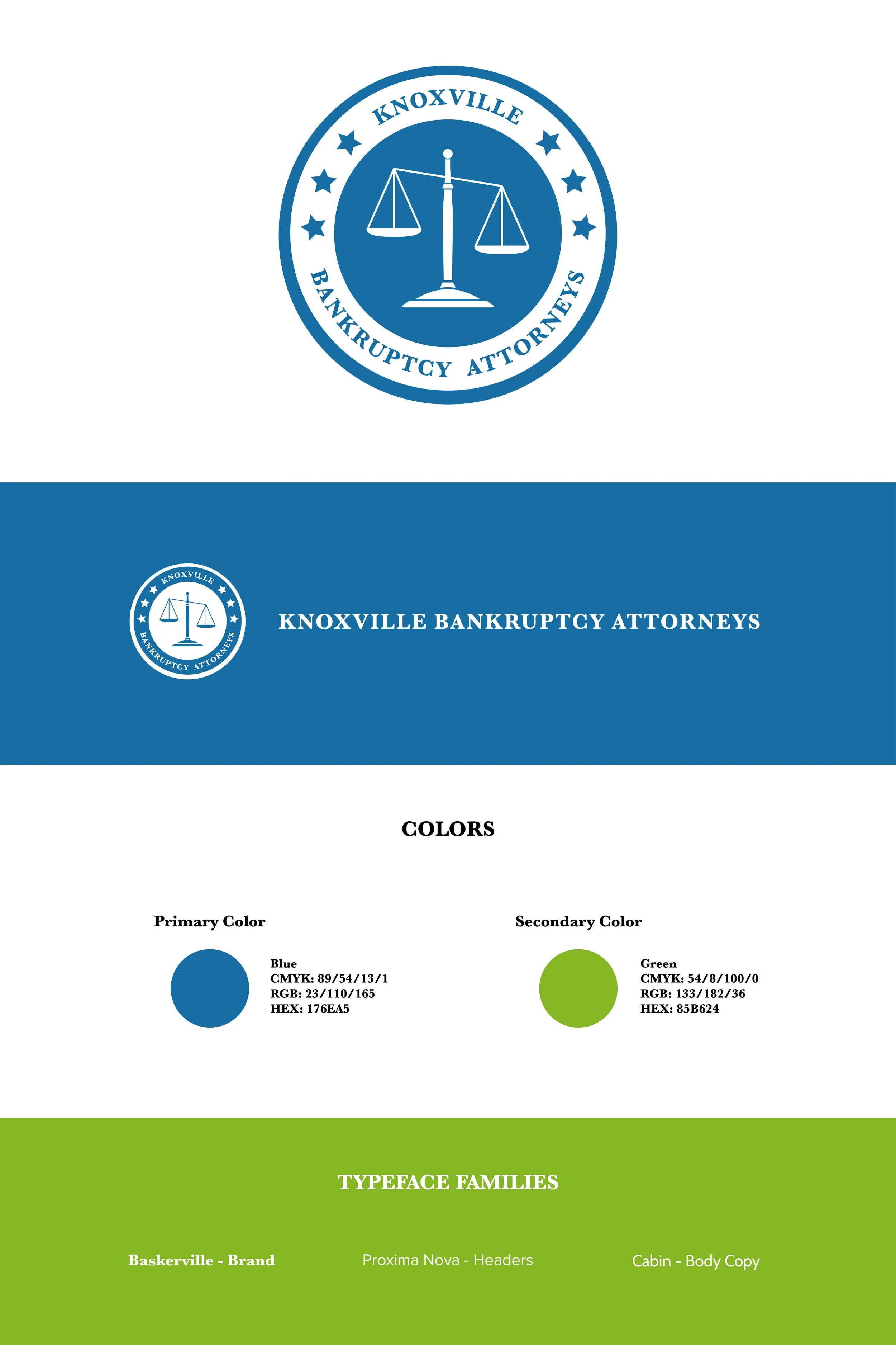
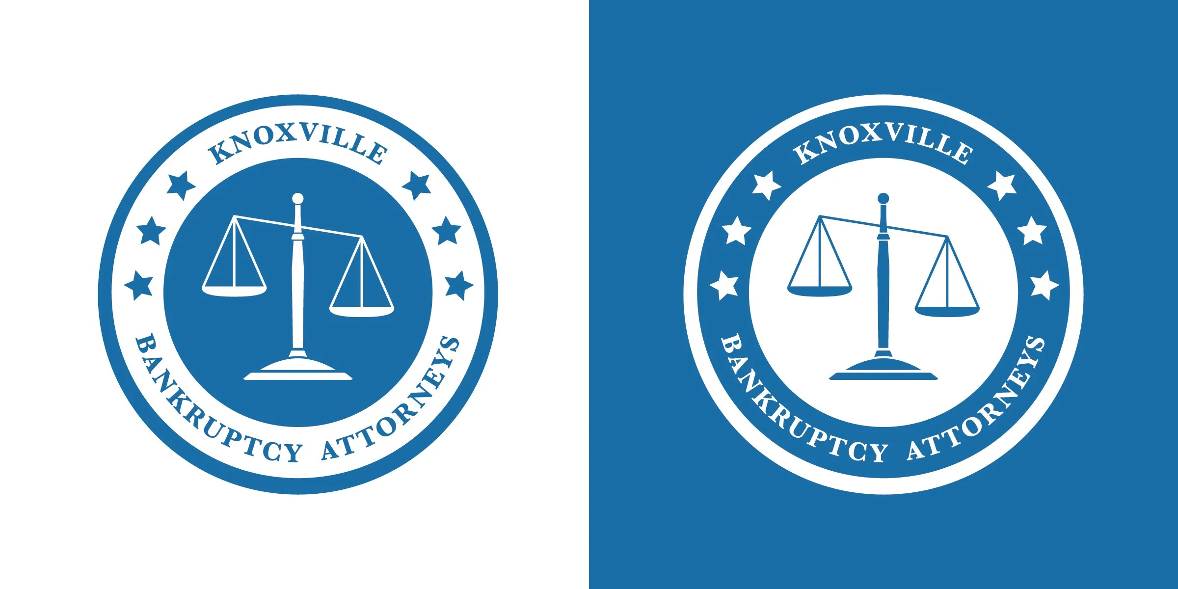
After presenting multiple refined options, the selected direction featured the scales of justice enclosed in a circular shield — communicating both protection and the idea of tipping the balance in the client's favor. Baskerville was chosen for the logo's formal character, paired with Proxima Nova and Cabin for their web-readability and approachability.
Packaged for Use.
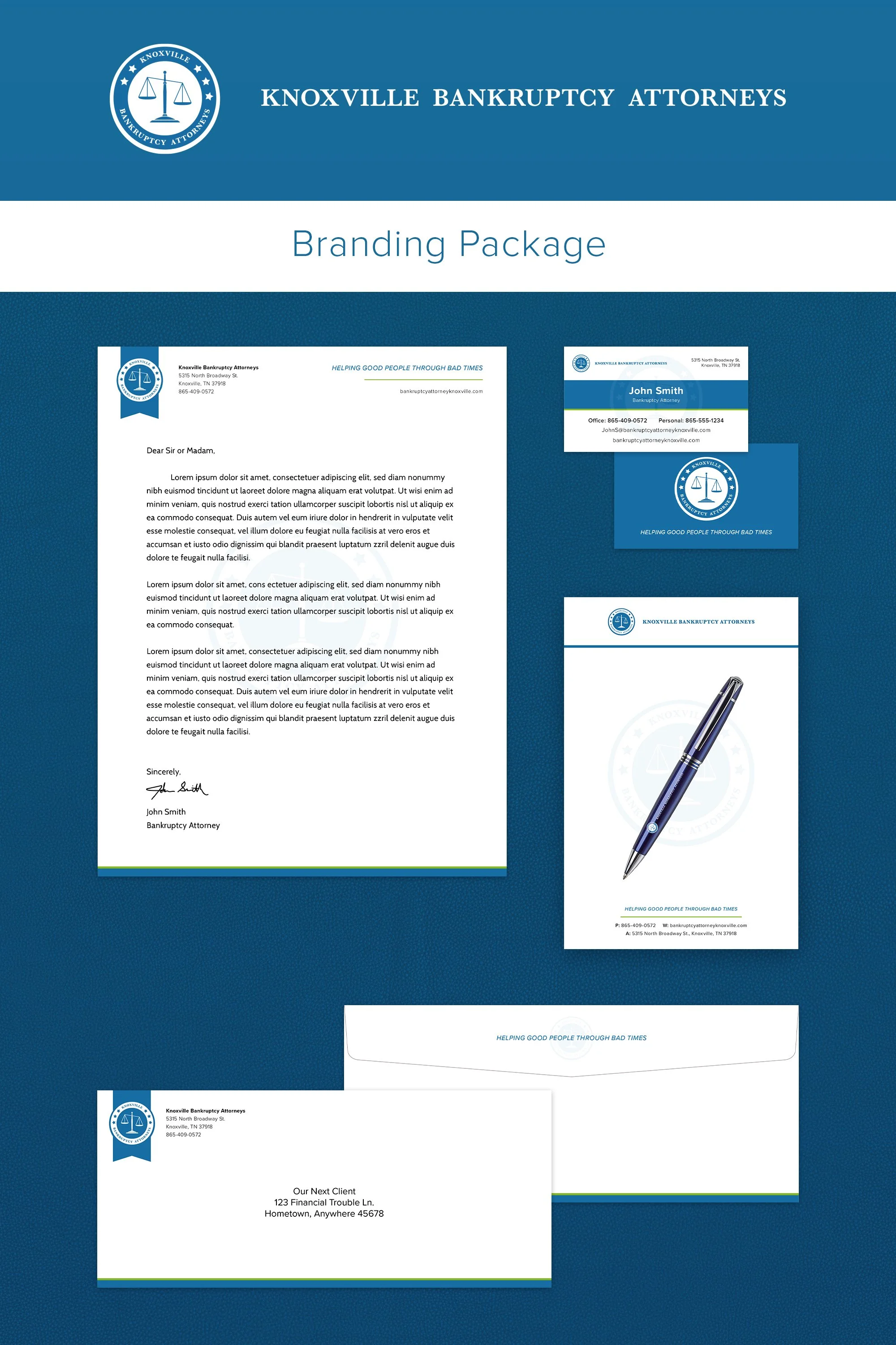
A full brand package was developed including business cards, letterhead, envelopes, notepad, and pen. A complete brand identity and collateral package that gives the practice a professional, distinctive presence in a competitive local market.